Zwift Charts: Demographic and Performance Analysis for Zwift Events
Zwift Charts is a free add-on and tool for the Chrome browser that provides cyclists with data visualizations for Zwift events. Developed by Zwift Charts, this program aims to enrich Zwift-related sites with post-event analysis of demographic and performance data.
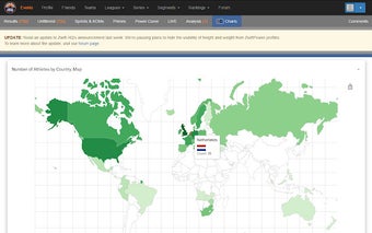
For users of ZwiftPower.com, ZwiftCharts offers a range of charts and statistics to explore. These include a global map highlighting the number of participants from different countries, gender distribution statistics, breakdowns of athletes by age and categories, and comprehensive charts for weight, height, power, and heart rate distributions. Additionally, users can compare time vs. average power, average power vs. average heart rate, and weight vs. heart rate and power.
For users of WhatsOnZwift.com, Zwift Charts replaces the default workout chart with an interactive one. It also overlays a W'bal chart and reveals the minimum W'bal value specific to each workout. Understanding W'bal data is crucial for estimating the feasibility of a workout, allowing users to identify demanding workouts in advance.
Whether you're a competitive cyclist or a recreational rider, Zwift Charts offers a data-driven perspective on your virtual cycling endeavors. To access the charts, simply visit the relevant Zwift event page on ZwiftPower.com or open a specific workout page on WhatsOnZwift.com and follow the provided instructions.


